The psychology behind
2024 interior design colour trends
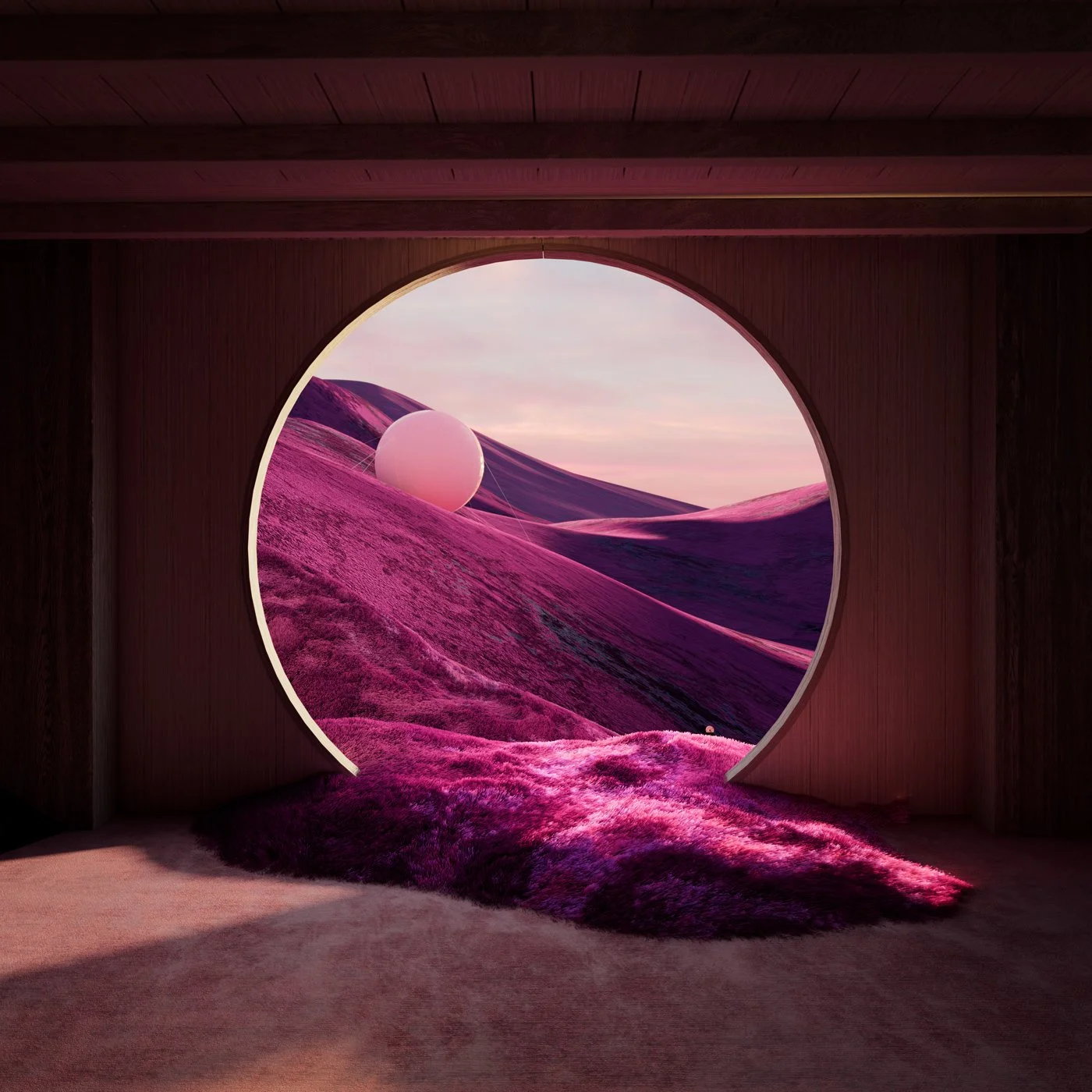
Notice the soft, plush textures in this image, the smooth curves of every element, and, significantly, the soothing colours present throughout. The visual artist, Andres Reisinger, specialises in the creation of out-of-this-world digital spaces, characterised by his signature dream-esque colour schemes.
In the same way that Reisinger so cleverly utilises the colour combination of subtle pastels, vibrant berry pinks, and deep fuchsia tones to evoke a feeling of warm, blissful calm in the observer, colour psychology – the scientifically proven effect of different colours and tones on a person’s mood - is increasingly being utilised to evoke positive emotions in real-world interior design projects too.
From nourishing greens to creativity-inducing oranges, this article discusses a selection of the WGSN 2024 colour predictions, and the ways they can be utilised to amplify the intended mood of a space.

The balancing colour of green recalls the soothing qualities of nature and can bring an optimistic sense of ease, relaxation, and stress relief when utilised with intention in a space. This makes it an increasingly popular colour choice for wellness spaces, and even workspaces too, where employers hope to create an environment that elicits positive emotions in their employees and boosts their productivity.
Green, being the colour that the human eye can perceive more shades of than any other, is also highly versatile to use in interior design. A yellow-toned scheme creates a positive, warm atmosphere, whereas a cooler, minty green feels invigorating and refreshing. Take the WGSN 2024 go-to green, Nephrite, for example - the delightfully mossy tones make it the perfect shade to create a sense of warmth and wellbeing in any space.
Nourishing nephrite green

Colour psychology demonstrates that the colour orange has the potential to boost feelings of creativity, energy, positivity, and even hunger. Cleverly designed spaces could, therefore, harness the bright hues of Europes 2024 orange colour of choice, Apricot Crush, to their psychological advantage. For example, a hospitality space which relies on food sales could benefit from the subtle, appetite-enhancing properties of an Apricot-Crush-interior, and a creative start-up could utilise the energising, mental-activity increasing effects.
However, as research shows that the exciting properties of bright orange spaces could make it difficult to engage in focused tasks, facilities such as libraries or conference rooms may want to take a light touch when incorporating orange into their interior design.
Creative apricot crush

Soothing cornflower blue
Bringing to mind images of serene oceans and expansive summer skies, a blue interior is sure to create a feeling of unparalleled calm in its inhabitants. Shown to reduce blood pressure and slow heart rate, colour psychology indicates that blue is a top choice for any space where relaxation is the priority.
A blue colour scheme is therefore an excellent fit for hotel bedrooms, lulling guests into a blissful, contented sleep. However, for those wanting to bring an edge to this otherwise soft and classic colour, opt for the 2024 Cornflower Blue, and combine with harsher industrial metals and modern silhouettes, or play with blocks of Cornflower Blue within a neutral space.